
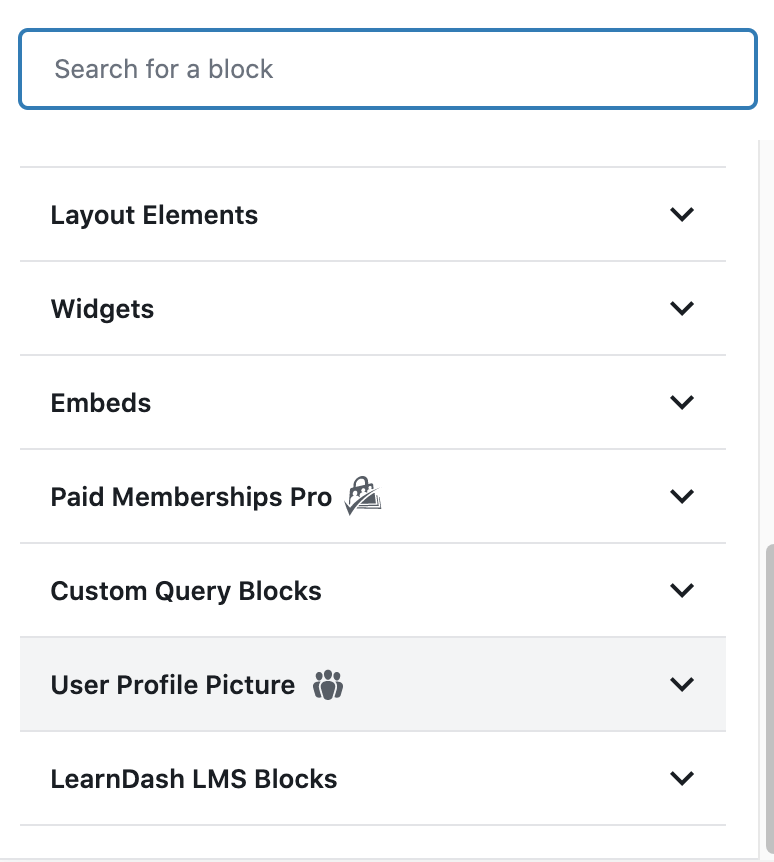
For block collections, it’s useful to group your blocks into a category for organizational purposes. In this tutorial, I will. show you how to create a category for your blocks and how to add a custom SVG icon.
Adding the Category
Adding the category is pretty simple. It all starts with the block_categories filter. Let’s dive into the code needed. For example, here’s how Paid Memberships Pro does it for their block category:
/**
 * Add PMPro block category
 */
function pmpro_place_blocks_in_panel( $categories, $post ) {
	return array_merge(
		$categories,
		array(
			array(
				'slug'  => 'pmpro',
				'title' => __( 'Paid Memberships Pro', 'paid-memberships-pro' ),
			),
		)
	);
}
add_filter( 'block_categories', 'pmpro_place_blocks_in_panel', 10, 2 );Code language: PHP (php)
There’s a third argument called icon that you can use to assign a dashicon to the block category. For example, re-using the above code, you could do:
function pmpro_place_blocks_in_panel( $categories, $post ) {
	return array_merge(
		$categories,
		array(
			array(
				'slug'  => 'pmpro',
				'title' => __( 'Paid Memberships Pro', 'paid-memberships-pro' ),
				'icon'  => 'editor-table',
			),
		)
	);
}
add_filter( 'block_categories', 'pmpro_place_blocks_in_panel', 10, 2 );Code language: PHP (php)
A more elegant example is on a post entitled Creating a Block Category if you wish to check that one out. Here’s the result of adding the above Dashicon to the block category.
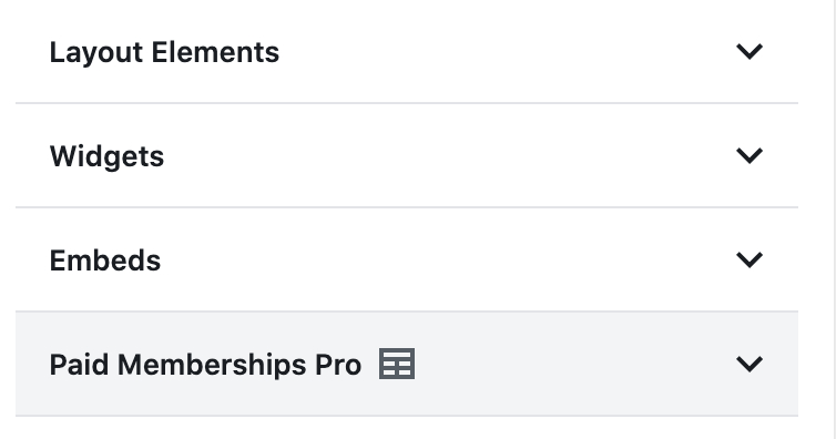
It’s really that simple. But what if you want to add a custom icon that isn’t a dashicon?
Adding a Custom Icon
To add a custom icon, you need an SVG version of your icon. It should be lightweight so it doesn’t balloon your file size, and there are some caveats to look out for. In the example below, I’ll be using JSX to include the icon. You’d include it either as a component, or inline in your block initialization script, which is the approach I’ll be taking.
For example, here’s some raw SVG code that is JSX-friendly (I grabbed it from Google’s Material Library).
<svg xmlns="http://www.w3.org/2000/svg" height="24" viewBox="0 0 24 24" width="24"><path d="M11.99 2c-5.52 0-10 4.48-10 10s4.48 10 10 10 10-4.48 10-10-4.48-10-10-10zm3.61 6.34c1.07 0 1.93.86 1.93 1.93 0 1.07-.86 1.93-1.93 1.93-1.07 0-1.93-.86-1.93-1.93-.01-1.07.86-1.93 1.93-1.93zm-6-1.58c1.3 0 2.36 1.06 2.36 2.36 0 1.3-1.06 2.36-2.36 2.36s-2.36-1.06-2.36-2.36c0-1.31 1.05-2.36 2.36-2.36zm0 9.13v3.75c-2.4-.75-4.3-2.6-5.14-4.96 1.05-1.12 3.67-1.69 5.14-1.69.53 0 1.2.08 1.9.22-1.64.87-1.9 2.02-1.9 2.68zM11.99 20c-.27 0-.53-.01-.79-.04v-4.07c0-1.42 2.94-2.13 4.4-2.13 1.07 0 2.92.39 3.84 1.15-1.17 2.97-4.06 5.09-7.45 5.09z"/><path d="M0 0h24v24H0z" fill="none"/></svg>Code language: HTML, XML (xml)An example of a non-JSX friendly SVG is shown below:
<svg id="Layer_1" data-name="Layer 1" xmlns="http://www.w3.org/2000/svg" xmlns:xlink="http://www.w3.org/1999/xlink" viewBox="0 0 400 400"><defs><clipPath id="clip-path" transform="translate(-106 -196)"><path d="M476.41,296.5a1.17,1.17,0,0,0,0-.26c0-.19-.05-.37-.08-.57a1.14,1.14,0,0,1-.06-.25c-.06-.25-.1-.48-.17-.72a1.89,1.89,0,0,0-.11-.25,2,2,0,0,0-.17-.47,2.36,2.36,0,0,0-.12-.28c-.07-.16-.16-.32-.23-.47s-.07-.14-.11-.22-.26-.43-.38-.62a2.43,2.43,0,0,0-.14-.2,3.64,3.64,0,0,0-.35-.45,2.09,2.09,0,0,1-.14-.17c-.14-.19-.32-.34-.46-.53,0,0,0,0-.07-.05-.17-.17-.37-.36-.56-.52l-.17-.13c-.14-.12-.3-.23-.44-.34l-.23-.14a3.74,3.74,0,0,0-.49-.3c-.05,0-.14-.07-.18-.11l-.59-.29-.14-.05s0,0,0,0L309.66,217.45a9.07,9.07,0,0,0-7.29,0L141.08,289.09s0,0,0,0l-.13.05-.58.29c-.06,0-.14.07-.19.11s-.34.2-.5.3l-.22.14c-.15.11-.3.24-.46.34a.91.91,0,0,1-.16.13c-.2.16-.39.35-.58.52l-.05.05a5.82,5.82,0,0,0-.46.53.76.76,0,0,0-.15.17c-.13.15-.23.31-.34.45l-.15.2a3.9,3.9,0,0,0-.37.62l-.11.22c-.07.17-.16.33-.23.48s-.09.2-.13.29-.13.33-.18.48a1.31,1.31,0,0,1-.09.26c-.07.23-.12.48-.17.72a1.83,1.83,0,0,0-.06.25,5.62,5.62,0,0,0-.09.57c0,.09,0,.16,0,.25,0,.27,0,.54,0,.81V494.55a9,9,0,0,0,5.32,8.2l161.46,71.71.06,0a4.41,4.41,0,0,0,.72.26.91.91,0,0,0,.14.07c.27.07.56.14.84.23,0,0,0,0,0,0a9.1,9.1,0,0,0,3.7,0s0,0,0,0c.29,0,.58-.16.84-.23,0,0,.09,0,.15-.07.25-.07.48-.17.72-.26l.05,0L471.1,502.75a9,9,0,0,0,5.33-8.2V297.34c0-.27,0-.54,0-.81l0,0ZM306,235.39,445.4,297.3,306,359.21,166.64,297.3,306,235.39Zm-152.49,75.7,143.52,63.76V552.44L153.53,488.69V311.09ZM315,552.44V374.85l143.52-63.76v177.6L315,552.44Z" fill="none"/></clipPath></defs><image width="400" height="400" xlink:href="data:image/png;base64 (code intentionally shortened)Code language: HTML, XML (xml)Some things to look out for when converting your SVG for use in JSX:
- Look for any style attributes. In JSX, style must be an object and not a string. If you don’t need the style attribute, simply remove it. If you do need it, it’ll have to be in
style={{backgroundColor: red}}format. - Look for HTML/XML-specific attributes such as
xmlns:clink. It’s better to remove those attributes. - Convert
xlink:hrefto JSX-friendly attributes such asxlinkHref.
I’m sure there are others. Please leave a comment below if you’re aware of other caveats.
Now that we have our SVG, how do we add it in? The code is fairly simple (I’m picking on Paid Memberships Pro again):
( function() {
	const PMProSVG = <svg xmlns="http://www.w3.org/2000/svg" height="24" viewBox="0 0 24 24" width="24"><path d="M11.99 2c-5.52 0-10 4.48-10 10s4.48 10 10 10 10-4.48 10-10-4.48-10-10-10zm3.61 6.34c1.07 0 1.93.86 1.93 1.93 0 1.07-.86 1.93-1.93 1.93-1.07 0-1.93-.86-1.93-1.93-.01-1.07.86-1.93 1.93-1.93zm-6-1.58c1.3 0 2.36 1.06 2.36 2.36 0 1.3-1.06 2.36-2.36 2.36s-2.36-1.06-2.36-2.36c0-1.31 1.05-2.36 2.36-2.36zm0 9.13v3.75c-2.4-.75-4.3-2.6-5.14-4.96 1.05-1.12 3.67-1.69 5.14-1.69.53 0 1.2.08 1.9.22-1.64.87-1.9 2.02-1.9 2.68zM11.99 20c-.27 0-.53-.01-.79-.04v-4.07c0-1.42 2.94-2.13 4.4-2.13 1.07 0 2.92.39 3.84 1.15-1.17 2.97-4.06 5.09-7.45 5.09z"/><path d="M0 0h24v24H0z" fill="none"/></svg>;
	wp.blocks.updateCategory( 'pmpro', { icon: PMProSVG } );
} )();Code language: JavaScript (javascript)
I placed the above code in my initialization JavaScript file for the block.
Now here’s what the icon looks like now.
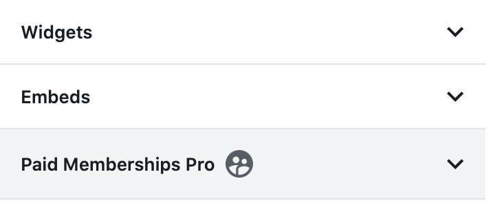
That’s it!
Debate Over Category Icons
There’s some debate over if block categories should have icons. I’m of the position of, why not?
Others have mentioned that the icons should blend in with the existing Gutenberg scheme (black and white). Other block category icons are full on color mode such as JetPack and WooCommerce.
I’m unsure of what the best practices are, but in my opinion it’s your plugin, so do with it as you wish. Users will be the ones complaining, while others may look at the icon, sigh in frustration, and move on with their lives.
If you have your own perspective, please leave a comment below.
Conclusion
Within this article I showed you how to create a custom block category, add a block icon, and went over briefly a point of contention in regards to block categories having icons.


